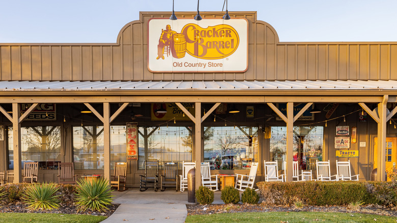
What Is The Story Behind Cracker Barrel's Logo?
Cracker Barrel's logo is warm and welcoming. Its mellow tones of dark brown and soft gold set the mood of hospitable service the restaurant strives for. But where did the logo originate? Surely, the first thought may be that the gentleman sitting in the chair is somehow related to the company's founder, Dan Evans. There's even speculation that the man is Dan's Uncle Hershel, Cracker Barrel's goodwill ambassador. While that would make sense due to Uncle Hershel's influence on the brand, that's not the case. In truth, the logo's origins involve a simple napkin sketch, but its message is a deep one and has evolved over time.
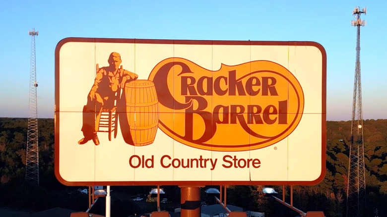
Initially, Cracker Barrel didn't have a set logo until 1977. Its signage was simply "Cracker Barrel Old Country Store," inscribed in yellow, Old Western-style font on a brown emblem. Following the expansion of his business, likely due to the instantly loveable homestyle favorites and tasty hidden gems on the menu, Dan Evans wanted to redesign the logo. This led him to connect with graphic designer, Bill Holley. Evans explained that he wanted something that could be best described as "rustic nostalgia" (which can also be felt in Cracker Barrel's iconic look), recalling a childhood memory of an old man in overalls who'd sit on his front porch in the summer. Most importantly, he wanted something that "wasn't corny." Holley understood, sketching the seated man (whom they nicknamed "Old Timer") with one arm perched on a barrel next to the brand's name.
Cracker Barrel's logo evolved over time, but the hospitality remained
Like other former logos you've probably forgotten about, Cracker Barrel's logo underwent various changes. When Holley first designed the official logo in 1977, it was light yellow with warm brown font, and included a swooping line embellishment that intersected the "k," "r," and "b" rounding the restaurant's name. It also featured Old Timer, leaning against his barrel, welcoming patrons. In 2006, Cracker Barrel modernized its logo to be bolder and more straightforward. The colors were intensified with crisp, sharp lettering. The shadowing of Old Timer was also enhanced, making his look less specific to better relate with the public.
After the spread of a viral rumor in 2015 and later in 2021 claiming the logo was racially charged, it went under scrutiny. The claim stated that the term "cracker" in the restaurant's name and the swooping line were representative of a slave whip. This sparked an outrage that inspired a petition to change the logo with the rumor returning in 2021. Fortunately, this was disproven with Cracker Barrel even responding to the allegations. The company clarified that "the part of the logo being referenced is a flourish, which is used in the calligraphy of the logos of many brands." However, Cracker Barrel still changed its logo. Now, the line from the "k" intersects directly with the outline. Old Timer has also reverted to a clarified appearance, along with a capitalization of every letter in "Old Country Store" at the bottom.

